oreo dashboard
─=≡Σ((( つ•̀ω•́)つ take me to the page !introduction:
it all started one day at work in early 2025 when the Post Malone Oreos had just come out. my friend (jayjay on the dashboard, in case anyone's curious) offered to bring them in and they were (spoiler alert) amazing. a few days prior, i had actually bought the White Peach Oolong Tea ones from H Mart and they were (again, spoiler alert) disgusting. so, to balance it out, i naturally brought mine in too. we then asked ourselves, "what if we turned this into a thing and try a new Oreo every week?" every week, we tried a new flavor, my friend recorded everyone's scores in a little Excel spreadsheet, and our tasting group slowly grew larger. with all that information, i knew i could probably create a dashboard of sorts to better analyze and consolidate everything.
here's what i determined:
- overview page
- flavors + flavor breakdowns page
- reviewers + reviewer breakdowns page
- statistics
- average rating
- individual ratings
- standard deviation
- cookie details (flavor, wafer, ingredients)
day 1:
> i started working on this pretty late at night, so i didn't get too much done on the first day. my main goals were:
- convert Excel spreadsheet to a usable data format
- research dashboard UIs
> to tackle the first point, i wrote a Python script to convert the Excel spreadsheet to a JSON file using pandas.read_excel(). this got me from individual sheets to a usable dictionary of reviews.
> as for the second point, i've only ever really seen Power BI and Tableau dashboards. i was tempted to try my hand at that and just use an iframe, but my eagerness took over and i decided to table(au) (sorry) that idea for later. a quick search gave me some really interesting options to choose from:
- Tremor
- Highcharts
- Chart.js
- D3.js
> Tremor was the most appealing, on account of me wanting to convert my site to more actively use React (i say "more actively", but at present, the activeness is 0).
day 2:
> Highcharts was my next option, mostly because of its drill down functionality, which was relatively easy to implement, thanks to the documentation.
> i didn't include a video demo (i'm glad i even remembered to take screenshots this time), but the effect was pretty neat:
> all of that being said, there were a few flaws, mostly related to the UX: text positioning, identifying reviewer data points, viewing data, etc. i had too much content on one page, which personally, was making it difficult to navigate. i tried making some adjustments, but it just wasn't working out. bye highcharts, maybe next time.
day 3:
> at this point, i pivoted to Chart.js. however, Chart.js doesn't have a native drilldown feature, and i reaalllly wasn't too keen on writing that from scratch. this meant in addition to changing libraries, i also had to rethink my design as a whole. after sketching out a few mockups, i landed on a three-page dashboard: one page for the overview, one for the flavors, and one for the reviewers. this approach would allow me to show all of the data, but still appropriately sectioned off.
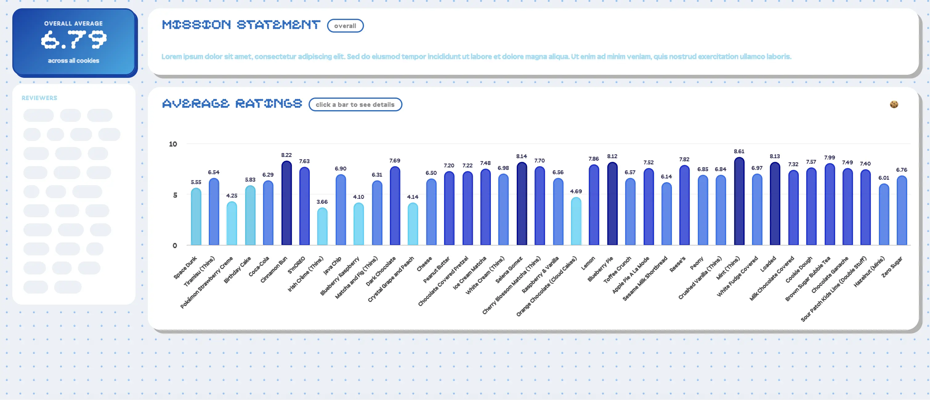
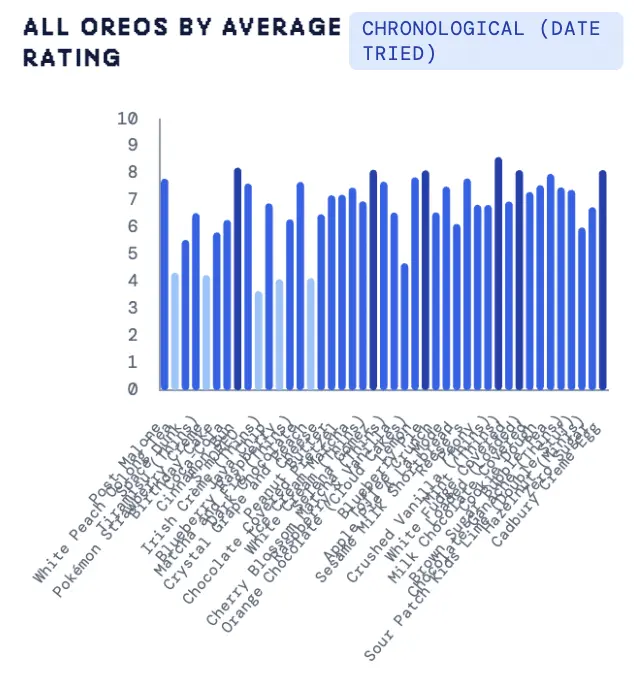
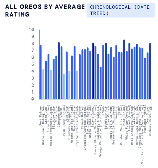
> similar to Highcharts, Chart.js has some very useful documentation. using the bar charts code as a reference, i recreated the original graph with all the flavors. i also added some standalone cards for general stats (total number of flavors, total number of reviewers, average rating of all flavors, favorite flavor, least favorite flavor, and most controversial flavor).
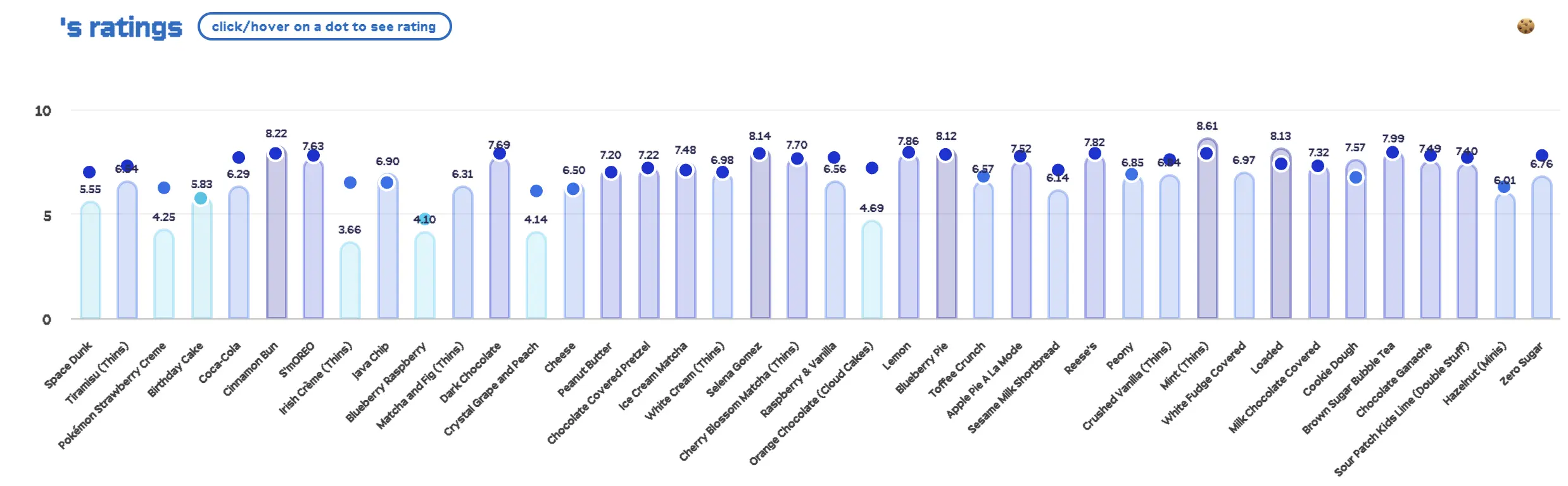
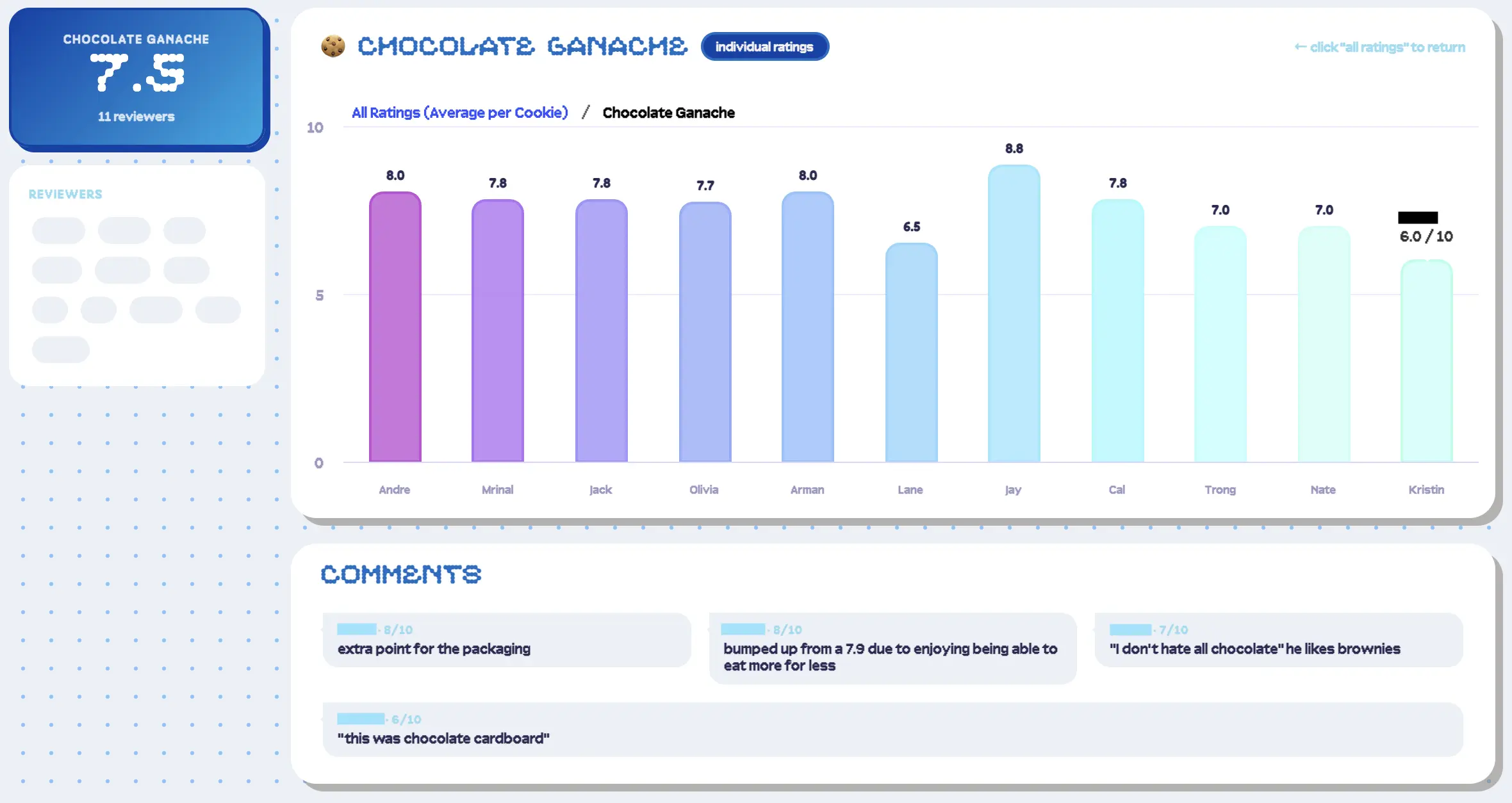
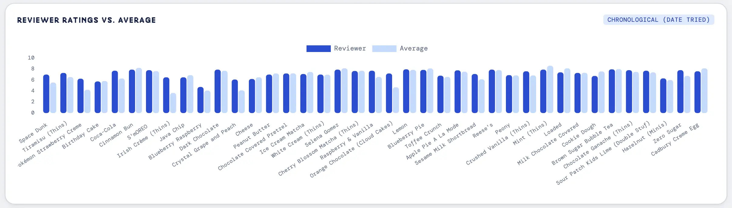
> now to the flavors page. to start, i populated a dropdown with all the flavors, where selection leads to the flavor's detail page. i recreated the original page, but changed the bar chart to a scatter and line plot (scatter for individual ratings, line for average) and also included cards for general stats (average rating, number of reviewers, standard deviation, percentile), like on the overview page. i did something similar for the reviewers page, e.g. stats, charts, and comments. one notable difference from the original design is that i moved away from the scatter point overlay and instead used a bar chart to represent the comparison. i felt this was a much easier way to visualize the data.
day 4:
> i now had pretty much all of the pages i cared about, but the UI needed improvement — there was a lot of whitespace on the flavors and reviewers page because of the single dropdown, and it wasn't easy to quickly navigate between the pages. whitespace aside, i also didn't think it made sense for the user to rely solely on the dropdown. so, i reused the card components to make "overview" screens for both pages.
> i created a card grid that displayed some high-level information and a placeholder image (e.g. average rating, number of ratings, number of flavors), where selection leads to the flavor's / reviewer's detail page. for consistency, i also applied this click event to flavor comments on the reviewer's page (go to flavor) and reviewer's comments on the flavor's page (go to reviewer).
> while creating these overview pages, i noticed that unrated flavors and flavors without individual ratings were getting thrown out of my dataset. i had totally forgotten that we didn't write down our ratings for the first two flavors and that we had some placeholder sheets in the Excel spreadsheet. i did want these flavors to show up on the dashboard though, so i updated the script to:
- include flavors without individual ratings on the overview page's full chart
- include unrated flavors in a "disabled" section on the flavors overview page
> because indvidiual ratings were lacking, some statistics didn't apply, so they needed to be removed from the flavor details page (similarly, unrated flavors didn't have any statistics).
> by this point, i was kind of pooped, so i switched over to the mind-numbing task of finding images for each of the Oreos. i later updated the JSON with these filenames, adding an "Image": "filename" name-value pair to the "Average" record, and updated the script to display this image instead of the placeholder.
day 5:
> with almost all of the layouts in place, i moved on to the filtering aspect. i had a few filters in mind:
- flavor profile / component (e.g. fruit, mint, etc.)
- filling (e.g. Thins, Double Stuf(f), etc.)
- wafer (e.g. cocoa (original), golden, etc.)
> i once again partook in a mind-numbing task: updating the JSON with this information by looking up each flavor and noting down the key characteristics (i promise i'm normally more efficient...). i updated the script to pull out all the data into respective sets and dump them in the sidebar, where the navigation links lived. i needed the charts and flavors overview grid to actually reflect these selections though, so i also created a method that updated the dataset used on each page when a filter was selected.
> because i had so many flavor filters, i also wanted a way for the user to select or deselect all of them at once, leading me to add "all" and "clear filters" buttons. i repeated these script changes for the filling types and the wafer types.
day 6:
> the last piece to implement was unrelated to the actual dashboard / data: dark mode! there's not much to say here, i basically just inverted all of the colors (white/grey → black, black → white, light blue → dark blue, original oreo → golden oreo). the charts were probably the most difficult part of this due to the way they are instantiated on load; i had to add a listener to the theme class to determine which colors to use.
day 7:
> with this, the dashboard was basically done. i went through each of the pages and tested each of the flavor and reviewer links. since all the functionality seemed okay, i turned my attention to tablet and mobile development. in full transparency, i've never viewed a dashboard on a mobile screen, so i wasn't sure what it was supposed to look like. a quick search gave me some good examples to go off of — i managed to keep most cards the same.
> i also addressed some minor issues found during testing, such as the x-axis labels overlapping due to font size:
final thoughts:
> this took sooo much longer than i expected. i spent a huge amount of time figuring out how i wanted the UI to look, and not strictly at the beginning, so i went through more iterations than i probably should've. there were also some aspects that ended up adding time to the process, like the chart creation and the theme listeners.
> key takeaways:
- plan UI/UX in more depth, even for smaller projects
- consider softwares designed for dashboards / data-visualization