INTRODUCTION
i'm a little crazy when it comes to Spotify playlists, in that i always make a new one every few weeks to capture whatever songs i had in rotation during that timeframe. i've been doing this ever since my friend introduced me to Spotify — proof for the curious:
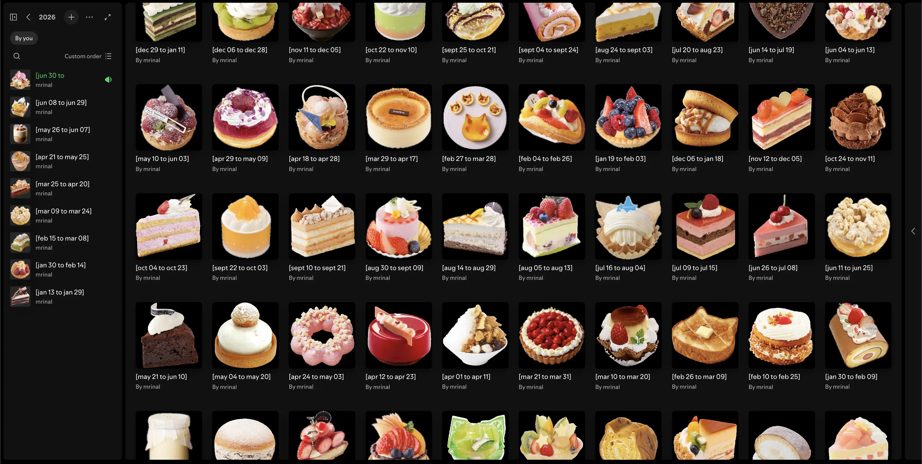
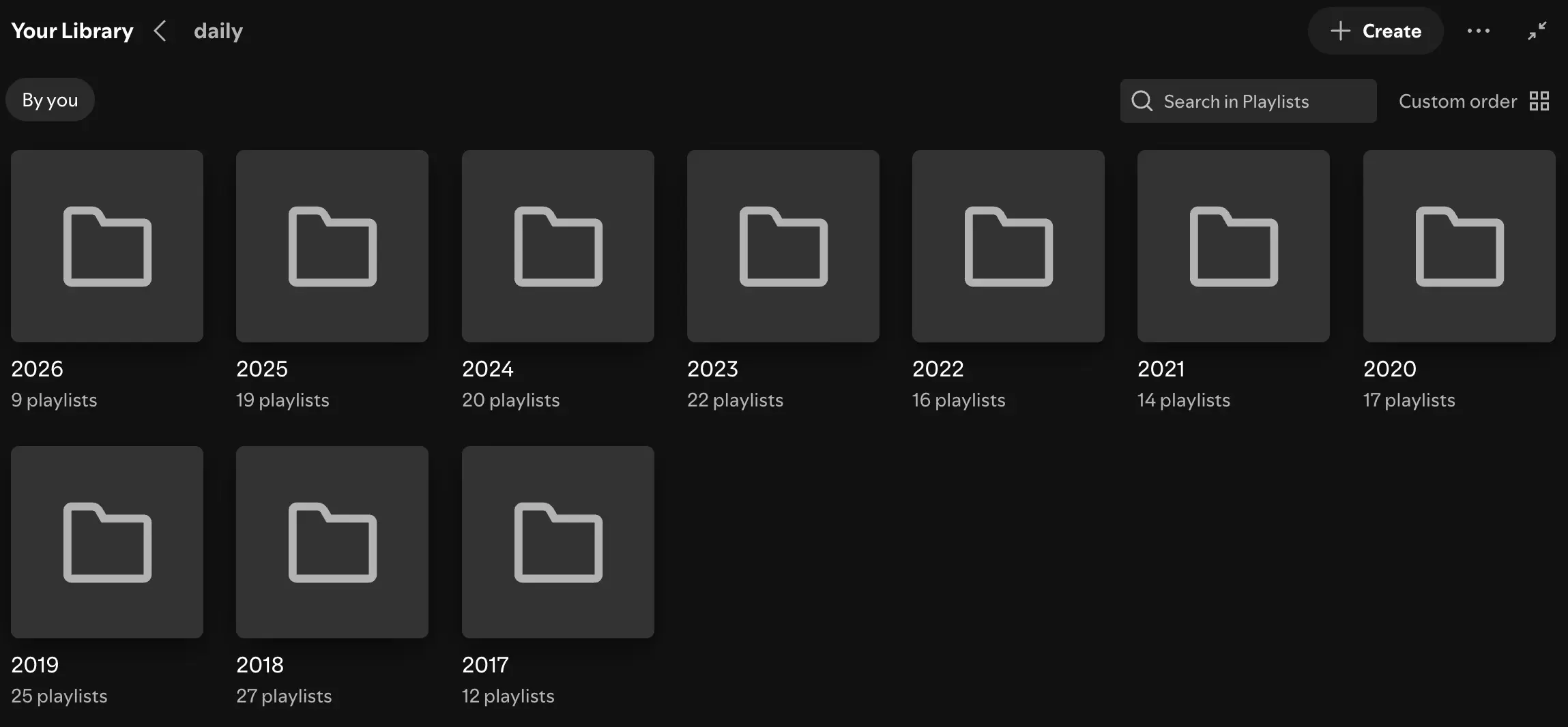
Spotify playlist folders (2017-present)
i wanted to take my library one step further and create a visualization for each playlist: a big spinning ring (songs in rotation, get it? haha) of album covers that you can flick around. i was inspired by early 2000s CD towers (think, Sharper Image DVD Power Tower 80, Fisher Slim 4000, etc.) that had a more interactive approach to engaging with your music.
here's what i determined:
- 3D rotating carousel of album covers
- live playlist data from Spotify
- audio previews on selection
DAYS 1-2
i started with the carousel itself, using fake hardcoded data so i wouldn't have to think about Spotify yet. the core of it is CSS 3D transforms: each cover gets rotateY(theta) translateZ(radius) to place it on the rim of a cylinder, and spinning the whole ring is just one rotation variable. i also tipped the ring forward a bit so you're looking slightly down into the loop — much nicer than a flat wall of albums.
the objects themselves were originally flat images for convenience.
i then built each 2D image up to be 3D, by turning it into a box (front, back, and four thin sides expanded from the original image) so that as it travels around the ring, you can see the spine, like books on a shelf.
this sounds simple, but was actually harder than i expected.
i tried following a few YouTube tutorials (2D to 3D ones sounded promising), but i spent quite a bit of time getting it to work.
ideally, i would have used a single color for the spine, but i think that would've meant additional color math on each image. the page is already pretty computationally heavy graphics-wise, so i decided to leave that idea alone.
for interaction, i wanted the ring to lazily drift on its own, and for a drag to fling it with momentum that decays back to the resting drift. this felt more intuitive behavior-wise instead of stopping dead.
this meant tracking rotation and velocity in refs and updating them in a requestAnimationFrame loop (state that changes 60 times a second does not belong in React state... yikes).
DAYS 3-4
Spotify's API uses OAuth, and since this page only ever needs to read my playlists, i went with their Authorization Code flow: i wrote a one-time login route to mint myself a refresh token, stashed it in an environment variable, allowing the server can exchange it for an access token whenever it needs one.
pulling the playlists after that was pretty straightforward. as seen in the images before, i name my playlists with a very specific convention (e.g. "[jan 13 to "), so this made it easy to filter using regex. again, as seen in the images, i have a lot of playlists. this felt like too much data for what the page was: what have i been listening to recently? so, i limited it to my last 10 playlists, which populated in a dropdown. i also found a shorter dropdown to be a better user experience.
one gotcha i ran into here is that i was using my own Spotify API knowledge that was actually years old. turns out, since i last used it, a lot of endpoints have been deprecated, including the one i was actively trying to use, the playlist tracks endpoint. the current endpoint nests everything under a differently-shaped object, so i had to rewrite my code once i figured out what was going on (the error message was not helpful). after this, i started referencing the API more closely instead of using prior knowledge (always follow the spec... always follow the spec...).
another gotcha was that my playlists were wildly different sizes, which resulted in weird formatting for a lot of them: my playlists range from a handful of songs to hundreds and i needed both to fit properly in the viewport. the trick was computing the chord length between neighboring covers on the rim and sizing each cover off of that — a short playlist got large, well-separated covers, while a packed playlist tightened into a solid band of albums.
for mobile, a horizontal ring doesn't work on a narrower screen. so, in portrait mode, the ring flips to spin vertically instead (more in line with the CD towers shared earlier), with the selected record popping out to the right. i also spent a really long time on all the formatting because there were so many moving pieces (no pun intended) in computing the sizes of each component.
DAY 5
now that i had the ring, interaction, and base movement working, the next step was to select and play the song. i wanted the action of tapping a cover to snap it to the front of the ring and bring it into focus. i did this by scaling up the object so that it appeared slightly larger than the ones in the ring. i also added a vinyl record that pops out halfway from the album. underneath this, a track details panel appears with the title, artist, album, and release date.
i obviously wanted the record to actually play something. sadly, Spotify's API no longer supports track previews, so i had to find an alternative. a quick Reddit search introduced me to Deezer, which serves previews (yay!). i wrote an enrichment route that looks up the Spotify track on Deezer when you select it.
while checking the audio, i noticed that some didn't match the tracks. debugging my API calls and the results, i learned that Spotify's track details and Deezer's weren't 1-1. for example, artists and tracks had slightly different name variations or there were multiple artists with the same name. to make sure i was playing the right song, i tried to match on ISRC (a cross-platform track identifier that Spotify provides) when available, and fall back to fuzzy title/artist matching when it wasn't (fuzzy here means trying my best to match on artist and track name). if no preview is found, the play button just links out to the Spotify URL instead. for the most part, Deezer is actively maintained - the only fallbacks came from niche TikTok audio-esque songs that didn't have claimed profiles.
while checking the audio, i also learned that Deezer previews are mastered LOUD, so i decided to cap the volume as well to about 20%.
DAY 6
the last key step was to add dark/light mode support (which meant including a separate inverted record image for the dark mode theme). the page was technically done at this point, but it felt unpolished. i waffled about what design changes could be made and landed on the following:
- add a playhead with a play/pause button
- have the vinyl record rotate on play and stop on pause
- navigation arrows -- selecting the previous or next track was proving difficult, especially with larger playlists. this lets the user walk the playlist without going back to the ring.
the track continues to auto-play on selection, but the addition of the play/pause button allows a user to have more of a say in that behavior. the playhead also made it easier to visualize how much of the preview had played. these were helpful from both a UX perspective and for filling the dead space.
getting the record to spin while the preview plays and stop smoothly when pausing was easy too - i used a JS-driven rotation instead of a CSS animation, specifically so it could ease to a stop easier. this behavior also prompted me to do the same for the audio, i.e. the audio fades in and out instead of cutting abruptly.
adding the arrows meant a second full set of layout math, including projecting 3D card positions back into screen coordinates to place them (because the arrows live outside the 3D scene, they don't automatically know where the album ended up). i seriously was not expecting this much trigonometry. UI tests me every day.
i added two texts to make the base page fuller: track count as a faded background overlay in the top left, and a how-to and dark mode toggle at the bottom of the page.
DAY 7
after reviewing and cleaning up my code, i pushed my changes and published the page. however, when i checked it out on my phone, the page kept crashing ( ˶°ㅁ°) !! i was able to confirm this behavior on my ipad as well.
some investigation told me that the page was eating a lot of VRAM — the memory on the GPU where it keeps everything it needs to draw frames without going back to the CPU.
every unique album cover gets uploaded there once as a texture, so with 30 tracks that's ~30 textures parked in VRAM for the whole visit.
on top of that, every element with transform-style: preserve-3d, will-change: transform, or backdrop-filter gets its own compositing layer (a whole framebuffer) allocated in VRAM —
and every one of my 30 vinyl discs had will-change: transform on it, so that was 30 extra framebuffers for no reason. i changed it so only the selected disc gets the hint.
phones and tablets share GPU memory with system RAM, so blowing past what fits means the GPU starts evicting and re-uploading textures (stutter), and in the worst case the OS just kills the page — hence the crashing.
this whole deep-dive prompted me to look into how to make my page perform better. i didn't love that an idle animation loop ran forever on this page, so i also made a change to handle the idle state. when no track is selected and the ring has settled back to its resting drift, the JS loop hands the rotation off to a plain CSS animation (which runs on the GPU compositor) and stops entirely. when a user touches the ring again, JS reads the current angle back out and takes over. this lets the page be less computationally expensive in its idle state.
since my playlists only change every few weeks, hitting Spotify on every visit felt wasteful. Spotify has rate-limiting enforced, which was an issue in the early development stages - i would quickly be blocked from querying my playlists during my multiple debug sessions. i sought out caching the data indefinitely, choosing to use a cache tag and creating a Vercel cron job to hit a revalidate route on a schedule (biweekly) to bust it. the page loads instantly and Spotify didn't have to constantly have me bugging it.
FINAL THOUGHTS
i'm pretty happy with how the page came out! sites like Framer and Readymag would probably make this concept much easier to implement. but i had fun doing it myself, especially working through all the unexpected math. ( ◡̀_◡́)ᕤ
key takeaways:
- APIs will change or remove features — cache what you can and have a fallback
- an "idle mode" that hands animation off to CSS is a cheap computation/performance win
- fast-changing animation values better belong in refs and rAF, not React state
- spend more time designing upfront